The Resurgence of Skeuomorphism in UI Design

In the sleek, minimal world of flat and material design, skeuomorphism has long been considered passé. Once the cornerstone of early UI/UX—think leather-stitched calendars and brushed metal music players—this style was largely cast aside in favour of cleaner, more abstract visual languages. Today, the pendulum is swinging back. Designers and users alike are rediscovering the tactile charm and intuitive clarity that skeuomorphism can bring to digital experiences.
What is Skeuomorphism, Really?
Skeuomorphism is the design approach where digital elements mimic their real-world counterparts. That can mean anything from a trash icon that looks like an actual bin to UI sliders that resemble physical knobs. It’s not just about aesthetics; it’s about leveraging familiarity to create intuitive interactions.
The style reached peak visibility during the iOS 6 era—apps like Notes, Calendar, and Game Center were drenched in real-world textures. But then came flat design, led by Apple’s own iOS 7 redesign. Suddenly, realism was out, minimalism was in.
What’s Changed Since 2025?
The resurgence of skeuomorphism isn’t just a repeat of past trends—it’s evolving. Designers are now blending subtle realism with modern aesthetics, adding tactile cues without overwhelming interfaces. Spatial computing, immersive apps, and advanced micro-interactions are bringing physicality into new digital contexts. Meanwhile, emotional design and accessibility considerations mean that skeuomorphic elements are chosen carefully to guide users and create more human-centered experiences. In short, skeuomorphism has matured: it’s no longer about nostalgia, but about meaningful, intentional interface design.
Skeuomorphism vs Flat vs Hybrid Design
For years, flat design ruled the digital world—clean lines, simple shapes, no frills. It made interfaces easy to scan and kept the focus on functionality. But flat design can feel a little… predictable. Skeuomorphism offers a way to add personality and tactile hints without losing clarity, bringing back subtle hints of the real world—soft shadows, tactile cues, and objects that feel like they could be touched.
The real magic happens when designers mix the two. Hybrid interfaces take the clarity of flat design and sprinkle in just enough skeuomorphic detail to guide users and make interactions feel more natural. A button might be mostly flat, but a gentle shadow or a soft animation gives it weight. A slider may follow flat styling yet move like a real-world knob. These touches don’t overwhelm—they communicate subtly, adding personality and depth without sacrificing usability.
In short, skeuomorphism isn’t about going backwards. It’s about combining the best of both worlds: the simplicity of flat design with the emotional, human touches that make digital experiences feel alive.
So, Why the Comeback Now?
1. The Digital World Feels Too Homogeneous
When every app starts to look the same, brand distinction suffers. Designers are reintroducing skeuomorphic cues as a way to re-inject personality into their interfaces. Texture, lighting, and dimensionality break up the monotony.
2. Physicality Feels Playful, Not Just Practical
Back in the day, skeuomorphism was used to help users understand digital interfaces by mimicking real-world objects—it was training wheels for a new medium. But after nearly 20 years of digital familiarity, users no longer need a leather-bound calendar to know how to schedule a meeting.
Today, skeuomorphism is making a comeback not because people need help navigating apps, but because we crave digital texture. Familiarity breeds not contempt, but confidence—users can now appreciate skeuomorphic touches as playful, tactile design flourishes, not functional crutches. The realism isn’t there to explain an action—it’s there to make it feel good.
3. Craft Over Generics in the AI Era
In a world where AI can generate endless flat, functional interface designs, skeuomorphism stands out as a marker of intent and craftsmanship. These handcrafted-feeling interfaces, rich with detail and nuance, are harder for generative tools to reproduce convincingly.
Today’s skeuomorphism isn’t just a style choice—it’s a statement. It signals that a human took the time to consider how something should look and feel. In an era where speed and automation dominate, that kind of thoughtful design is more valuable than ever.
It’s Not Coming—It’s Already Here

Airbnb’s Bold Move
A major signal that skeuomorphism is back came from an unlikely source: Airbnb. In their recent app overhaul, the company introduced a set of richly-detailed icons designed by a former Apple designer. These icons—representing rentals, services, and experiences—eschew the flat aesthetic that’s dominated UI for the past decade.
According to Airbnb’s VP of Design, Teo Connor, the company is leaning into richer, more tactile visuals to create emotional resonance and a sense of human connection. As she puts it in an interview on Dive Club:
“Adding more three-dimension, more things that feel or look tactile, that you want to touch… We wanted to encourage you to go and touch it and play with it… you’re really getting this sense of the app responding to you… like it’s a conversation, that it’s there, it recognizes you.”
This shift is evident in Airbnb’s use of 3D icons, haptic feedback, and playful micro-interactions—all part of a broader strategy to bring “vitality” and emotional engagement back into the app’s visual language.
Importantly, this wasn’t nostalgia for its own sake. The new design supports Airbnb’s evolving product strategy, which now includes offerings like personal chefs and in-home spa services, even if you aren’t booking accommodation. These tactile, metaphor-driven icons help guide users through an increasingly complex service suite.
By leaning into skeuomorphism, Airbnb isn’t just making things prettier—they’re making them easier to understand at a glance. That’s the whole point.

Apple’s VisionOS: Subtle, Spatial Skeuo
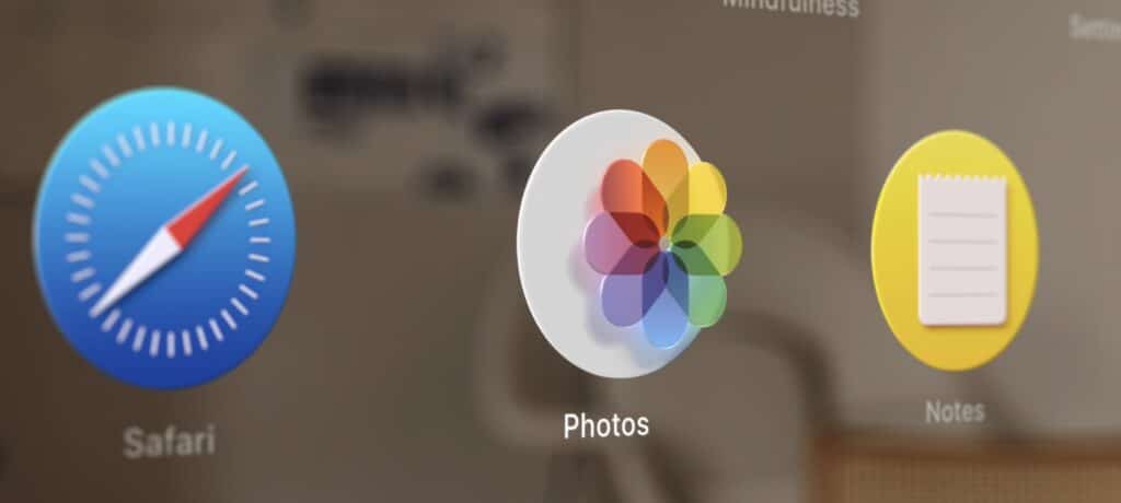
Apple’s VisionOS, the spatial operating system powering the Vision Pro, also subtly blends skeuomorphic principles with modern interface trends. While the OS is dominated by glassmorphism—translucent panels, depth through blur, and frosted layers—it quietly leverages skeuomorphism to make spatial interactions more intuitive.
Buttons and control elements often feature gentle shadows, soft gradients, and physical-like animations that suggest weight and presence in 3D space. For example, a volume dial in a media app may rotate like a real-world knob, complete with inertial feedback. These elements don’t mimic specific real-world materials, but they echo physical affordances in a way that feels familiar, especially in a new spatial computing paradigm.
This hybrid approach—glassmorphism for structure, skeuomorphism for affordance—signals a broader design shift where realism is no longer taboo, but rather one of many tools in a designer’s kit.
Skeuomorphism, Reimagined
Let’s be clear: today’s skeuomorphism isn’t about pasting leather textures everywhere. It’s more refined, more restrained. Think of it as “skeuomorphism reimagined”—a blending of visual metaphor and modern aesthetics.
- Soft shadows and gradients that imply depth without screaming “1990s.”
- Icons with enough realism to feel familiar but not so much that they distract.
- Interactions that mimic physicality (like pull-to-refresh) without needing a full woodgrain UI.
How to Use Skeuomorphism Effectively in 2026
Use It Sparingly
Not every UI element needs to mimic a real-world object. Pick your moments thoughtfully, focusing on elements that benefit from tactile cues or visual depth.
Prioritise Affordance
Make sure every design choice clearly communicates its function. Users should understand what an element does at a glance, without extra explanation.
Think Emotionally
Skeuomorphic touches can create warmth, trust, or even nostalgia—use them where they enhance the emotional experience rather than just for decoration.
Stay Consistent
Mixing hyperrealism with flat design can feel chaotic if it’s not handled carefully. Maintain a cohesive approach so your interface feels intentional and harmonious.
Conclusion: Skeuo’s Not Just Back—It’s Evolving
The resurrection of skeuomorphism isn’t about rejecting progress—it’s about balancing clarity, emotion, and usability. As Airbnb’s latest update and Apple’s VisionOS demonstrate, when done right, skeuo isn’t a throwback—it’s a powerful tool for guiding users through more complex and emotionally resonant digital experiences.
Flat design made interfaces cleaner. Skeuomorphism is making them feel human again.
Info
Posted: June 11, 2025
Reading Time:6 minutes
Author
Table Of Contents

